

Sign up to the Digital Six newsletter


An ecommerce product page AKA product display page or product detail page (PDP) is a specific web page on an ecommerce website that showcases detailed information about a single product, item, or service available for sale.
This is different from a product landing page, which is basically just a landing page that’s focussed on a specific product.
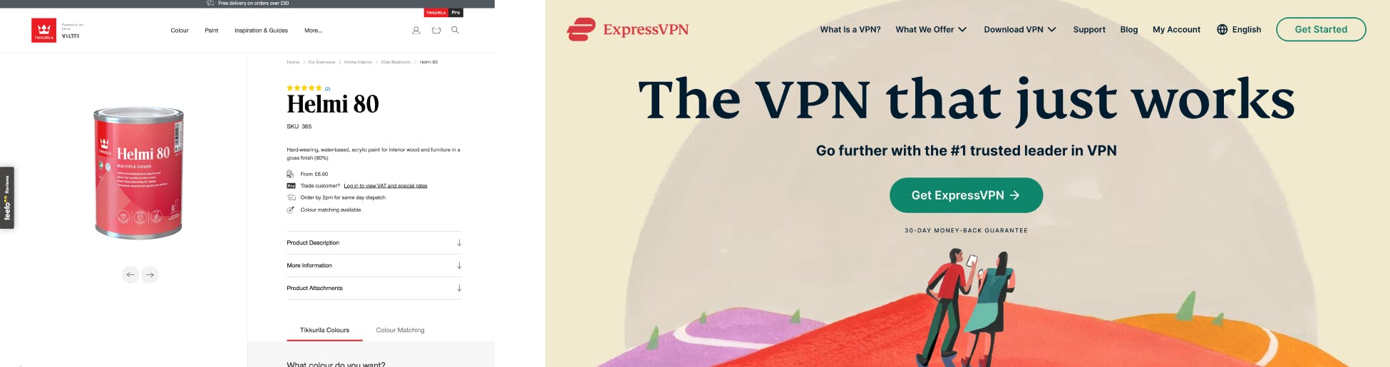
Aside from your ecommerce store basket and checkout pages, your product page is likely the last thing a user sees before they actually make a purchase.
We’ve covered the best way to improve visibility and traffic to product pages in our blog on SEO for Ecommerce Product Pages. The last thing you or users want at this stage is unnecessary “friction” in the buying journey.
Investing in improving UX on product pages can lead to increased visibility, engagement, trust, and ultimately, higher sales and revenue for your ecommerce business.
It’s a win-win situation for both your customers (who want to buy your products) and your business.
It’s important to prioritise the essential elements of ecommerce product pages. Make sure you’ve nailed the “essential” ecommerce page elements first to ensure a solid foundation, before adding secondary design features.
These elements can’t be missed, but remember there’s probably always room to improve them…
Typically, customers anticipate and value these components on product pages; however, not all websites and applications require each of these features.
These can really help to sell some types of products. Beware though, adding enhanced features could lead to distraction and disappointment when not implemented with solid user experience design research and understanding.
Pick the elements that will help your product page answer a user’s questions about your product. Keep in mind that if you offer a range of products, some might gain value from advanced page features, while others might only need the basics.
The “best” layout can vary depending on your specific industry, target audience, and the nature of your products. Our ecommerce design services can help you find the best layout for your business.
SaaS platforms like Shopify offer a variety of ecommerce themes that include page templates for your product pages. These templates offer all the essential elements in a recognisable and functional page layout.
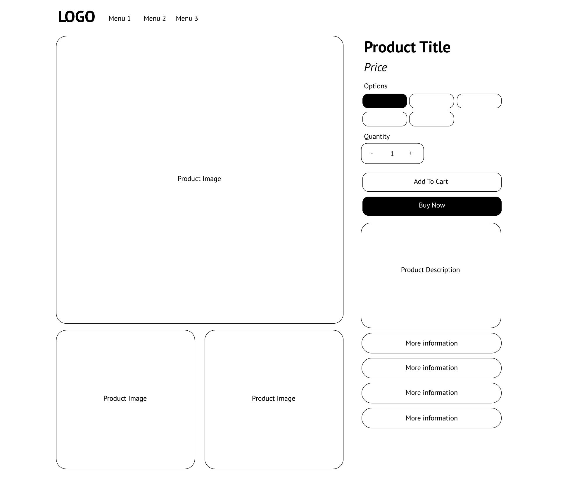
This page layout works well because it gets all the key information “above-the-fold” and emphasises the most important elements with a large product hero image and a prominent product title.
It may seem like a simple wireframe but it incorporates quite a few key elements:
So, you can fit a lot of super-useful information into relatively simple product page layouts. Be aware that there are still other optional and enhanced elements that these page templates won’t incorporate as standard. Things like:
Analysing user behaviour and testing different layouts can help you fine-tune your product page design to align with your customers’ preferences and needs. It’s advisable to keep up with current web design trends and seek inspiration from successful ecommerce websites.
That said, there are some definite “best practices” that we’ve picked up from our two decades in the ecommerce industry. Here are our top tips for basic ecommerce product page optimisation that stand up in 2024.
We’ve been designing and building brilliant ecommerce websites for over 20 years and we’ve learned a lot. Here are our top tips how you can make product page UX design work for your business.
Making only slight modifications to off-the-shelf theme templates might inadvertently undermine your brand and business.
Your brand carries its distinct recognition and establishes a robust foundation of trust signals for users.
Opting for off-the-shelf product page templates with minimal incorporation of your brand’s unique design elements could potentially cast doubt on the authenticity of your product pages.
It’s crucial to strike a balance between maintaining brand consistency and effectively utilising templates to ensure a seamless and trustworthy user experience.
It's important to create wireframes before you fully design complex product pages. Complex products can mean complex product pages, creating wireframes before adding branding and other design elements can help you to avoid costly re-working later.
There’s a whole host of reasons to take this approach, they include:
Our ecommerce design services can help your business wireframe its way to UX success.
It’s important to align your product page designs with your brand and users needs. But you don’t need to start from scratch.
User interface (UI) pattern recognition is a thing that you should use to your advantage. This cognitive phenomenon occurs when users become familiar with consistent design elements and behaviours, making it easier for them to navigate and interact with the interface.
Use wireframes to design recognisable product pages. Don’t be afraid to deviate and embellish where necessary but make sure you prioritise your users at every stage.
Remember, it's your customers that will be using the website to purchase good and services. We think we know our customers but they continue to surprise us. Undertaking well-structured and unbiased user testing is a crucial part of making profitable ecommerce UX design improvements. Our design and UX services focus on an iterative approach to test, validate, and improve to ensure your site is visually appealing, functional, and user-friendly, guaranteeing sustained customer satisfaction.
Product reviews provide genuine feedback from other customers, which establishes credibility and fosters trust in both your products and brand.
Reviews offer potential buyers insights into real customers’ experiences with the product, enabling them to make more informed and confident purchasing decisions.
Incorporating reviews adds user-generated content to your product pages, enriching them with diverse perspectives and information that can help to attract organic search engine traffic.
Positive reviews can lead to higher conversion rates as they address concerns and uncertainties that potential buyers might have about the product. Remember that a one-star review might not be as bad as you think.
Given the prevalence of false reviews – Feefo analysis suggests 72% of consumers are worried about fake feedback – people are actually more likely to be discouraged if they don’t see any critical comments.
Consumers are realistic; they know that no business gets every interaction right, every time. But they want reassurance that they can still expect a satisfactory experience if things go wrong.
Bear in mind that “almost seven in ten people (69%) will continue their purchase if they can see that the company has acknowledged a poor review, apologised and offered a solution.”
Source: Navigating the Negative PDF by Feefo
Negative reviews can also offer valuable insights into areas that may require improvement, helping you refine your products and enhance your customer service.
Secondary CTAs (Call to Actions) on product pages are additional buttons or links that encourage users to take specific actions beyond the primary goal, which is often to make a purchase. These secondary CTAs offer alternative paths or options that can be valuable to users and your business goals.
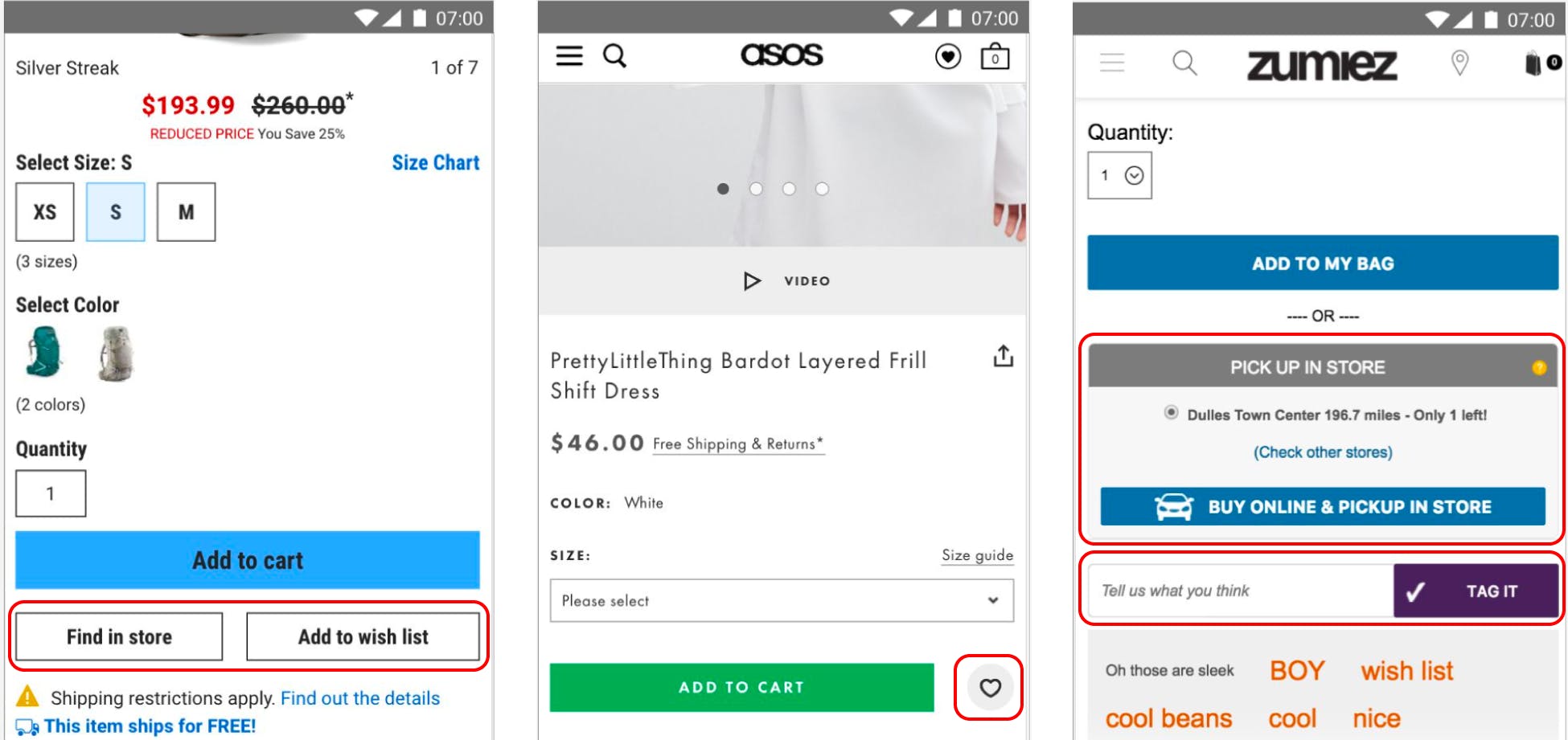
Secondary CTAs can include options to find in store (if your business has a bricks-and-mortar establishment/s), add to wishlist, and sharing options.
Product descriptions are central to users understanding your products but it’s easy for them to become overwhelming, especially if they’re describing the functionality of complex products.
To enhance the readability and comprehension of product descriptions for users, consider the following strategies:
Urgency elements are design elements or content that create a sense of urgency or scarcity on product pages. These elements can significantly improve product page conversion rates by motivating users to take immediate action.
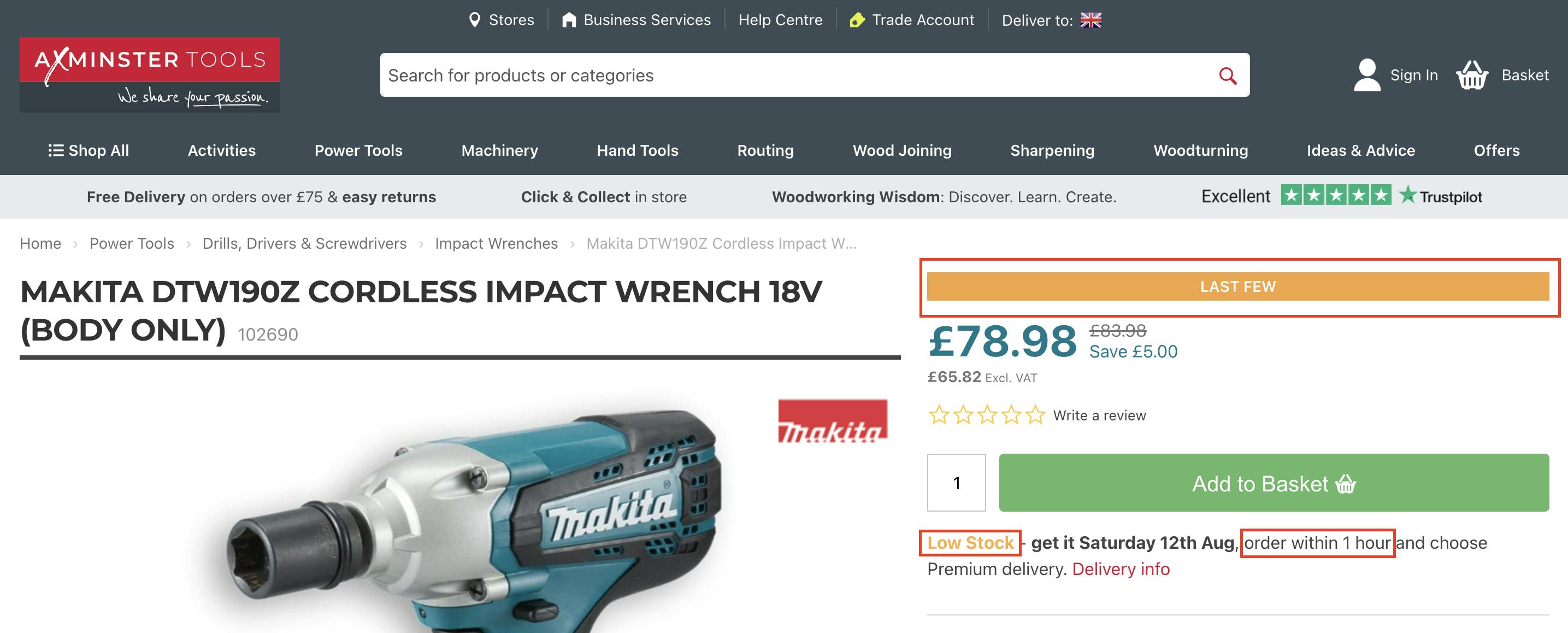
Using urgency elements well can improve conversion rates. Lyst, for example, saw “a 17% increase in conversion rate when urgency was highlighted.”
However, urgency elements should always be used with consideration and could even be damaging to your brand if overused. Overuse of urgency elements can result in:
In short, creating a negative user experience is the opposite of what you’re trying to achieve. Our design and UX services can help you understand how urgency elements should work for your business before implementing them,
Crafting exceptional user experiences on product pages is the cornerstone of success. By integrating key ecommerce page elements, adhering to a well-thought-out basic product page layout, and implementing valuable ecommerce product page UX tips, your brand can create a seamless and engaging shopping journey for your customers.
Careful selection and strategic placement of elements like product images, clear descriptions, pricing details, and prominent calls to action are fundamental to capturing users’ attention and guiding them towards conversion.
Remember, though, that addressing your users needs is the key role of your product pages.
What works for one business may be detrimental to another. Marrying key ecommerce page elements to culminate a harmonious shopping experience is a continuous journey of optimisation that can almost always be improved.
Our guide to ecommerce web accessibility (that improves brand and increases profit)
Creating a clean and functional redesign for Leith Export Co.'s website
Our guide to Progressive Web Apps for ecommerce
Some ecommerce marketing trends for 2024
Learn more about our individual ecommerce services on these pages: