 News and Insights
UX in Ecommerce: Finding What You’re Looking For
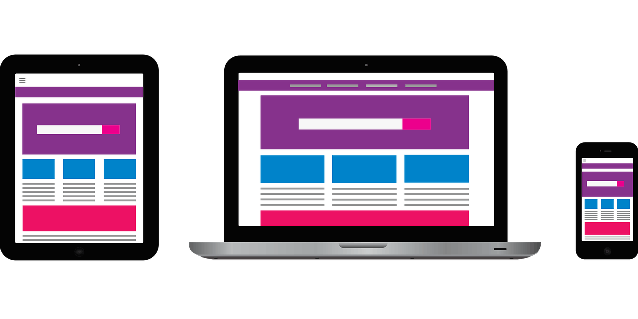
Back when the internet was young and comprised mostly of text and basic HTML, navigating a website could be a difficult task. Website design is now far more sophisticated, with search functionality having lots of bells and whistles to make it accessible, menus/navigation being incredibly responsive and categories better defined and less wordy. Within ecommerce, having a site visitor find what they are looking for with quickness and ease is a huge bonus to ROI and is good UX design practice.
Search Functionality
For all ecommerce sites, having a sophisticated and intuitive search functionality is a must and there are many things that need to be considered on top of this. Knowing your website’s key consumers and their intent is important when designing the search function.
To look at the most effective search experience for a shop with a large number of SKUs, we’re going to take a look at Staples.co.uk.
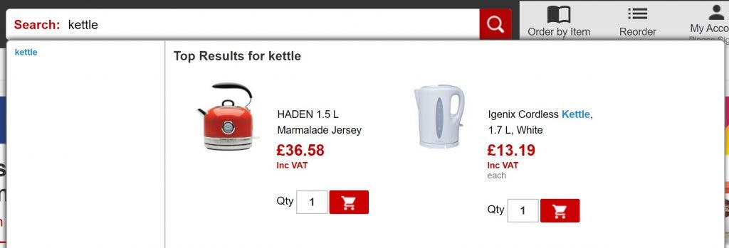
- The search functionality is clearly defined and uses the magnifying glass icon (as simple as possible) located at the top of the page with a clear CTA – It is easy for site visitors to find and the magnifying glass is a universally recognised search icon
- There is a button to trigger the search and the option to use enter – helps site users recognise there is an additional action to searching
- The search bar is sticky – site visitors can quickly access is even though they have scrolled down the page.
- The search bar is long enough for most search queries meaning that site visitors can keep track of what they are typing
- Lists auto-suggestions and popular searches as the searcher types – site visitors are prompted with search results so can find things quicker
- The popular products listed in the search drop-down can be added to the cart – speeding up this process for the site visitor
- Auto-correction of spelling – the search functionality is smart enough to know what the site user was intending to type and will direct them to the appropriate product or category
- The filter options presented on the search results page are specific to the products within – site visitors are able to narrow down what they are looking for much quicker
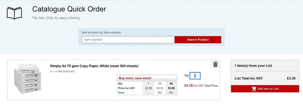
Staples also has a search functionality specifically for finding inks and toners, and a Catalogue Quick Order which means you search via the product number and it automatically creates a quick cart for you. This is particularly helpful for B2B site visitors or returning visitors who are looking for quick access to specific products.
Menus, Navigation & Categories
Menus and Categories are another thing that is dependant on the site itself. For sites that sell a huge variety of stock, it can be a struggle to have a menu and categories that present in a neat and easily navigable way, particularly in mobile view. Menu presentation and UX Design is a great opportunity to get creative with your website.As a good example of a best UX practices when it comes to Menus and Categories, we’re going to have a look at unique gifts retailer Firebox.com on mobile view.
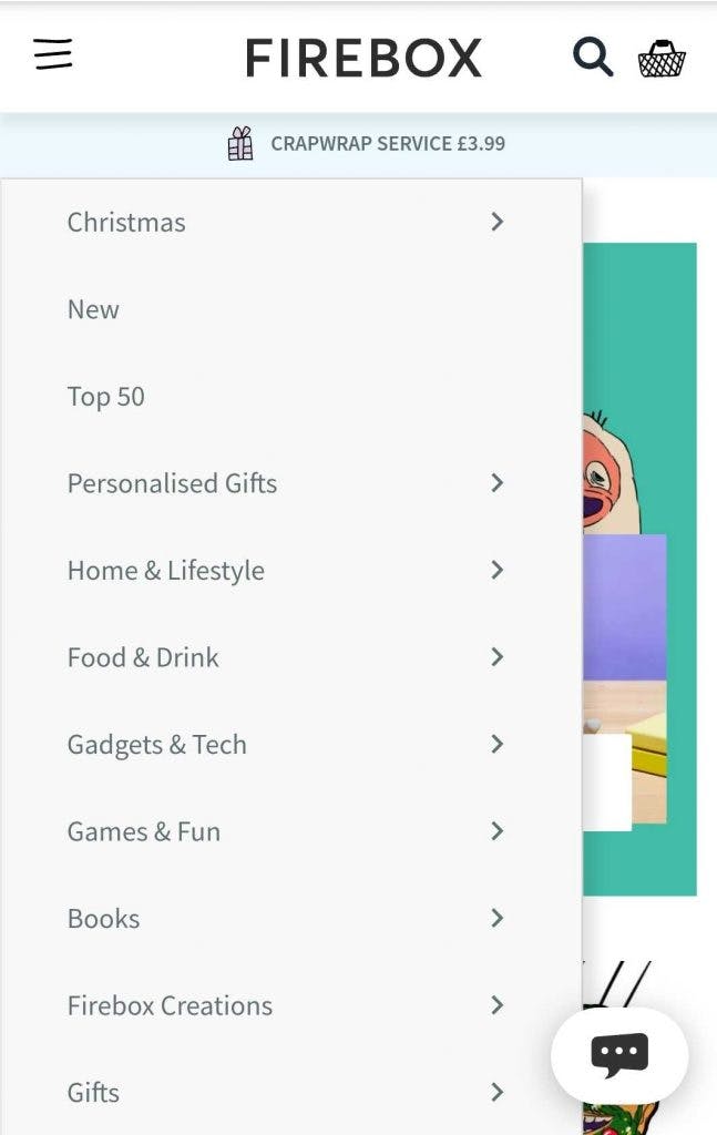
- There is a clear hamburger menu, search and cart icons – everything is one place and easy for site visitors to find
- USPs scroll below the menu – key pieces of information for site visitors regarding offers or key services
- Dropdown menu is easy to scan through and is fast – site visitor can quickly find category they are specifically looking for
- Category names only have 1 or 2 words in them and are descriptive – site visitor is able to skim read the options quickly
- Relevant “seasonal” category is at the top of the navigation – in this particular example, site visitors can jump to the Christmas gifts page quickly.
- “New” and “Top 50” categories also included – both of these will help undecided visitors narrow down their options to find the perfect gift
- Sub-categories are a little more detailed but are succinct and descriptive – points the site visitor towards areas of the site that will inspire or take the visitor to the specific area of the site they want to be
For sites with a narrower product range, you could go with a more personalised approach.
All of the most popular styles of ties are displayed on the homepage in an incredibly visually pleasing, fast and interactive way. The categories and subcategories are mostly single word titles, but the visual aspects aid to the descriptiveness of this.
Key Takeaways
- Ensure the search functionality is easy to find and simple to use
- Auto-suggest, auto-correct and popular searches being presented via the search functionality are important, especially with mobile friendliness
- Consolidated menus with clear, recognisable icons are visually pleasing and much easier to navigate
- Display USPs and service CTAs in the top menu and ensure the most relevant categories are near the top
- Keep category names that are detailed in menus, short and to the point to make is easier for a site visitor to digest and navigate accordingly
UX in Ecommerce Article Series
- What is UX & Why is it Important?
- 20 Years of UX Design
- The Beginning of the Consumers Journey
- Finding What You’re Looking For (this article)


