Sign up to the Digital Six newsletter

Where do users begin their journey on an ecommerce site? The pages that site visitors first land on have evolved since the beginning of ecommerce from the homepage to product pages. With things like paid advertising (particularly through targeted shopping adverts), social sharing, and more sophisticated organic search, product pages are taking over homepages with respect to the first page a visitor would hit first on a site.
Due to the evolution of landing pages, it becomes increasingly important to focus on the product page when it comes to the development of an ecommerce site. Homepages still have a place of importance, particularly for online shoppers who aren’t looking for a specific product. Like the contents page of a book, the homepages and product pages need to be well organised and display the necessary information.
Product pages are incredibly important in the UX design process for ecommerce. The key to good UX on a product page is showcasing the product in the best possible light and including all necessary information in an organised and intuitive way. Depending on the product there should be additional pieces of information that will further assist the customer with their decision.
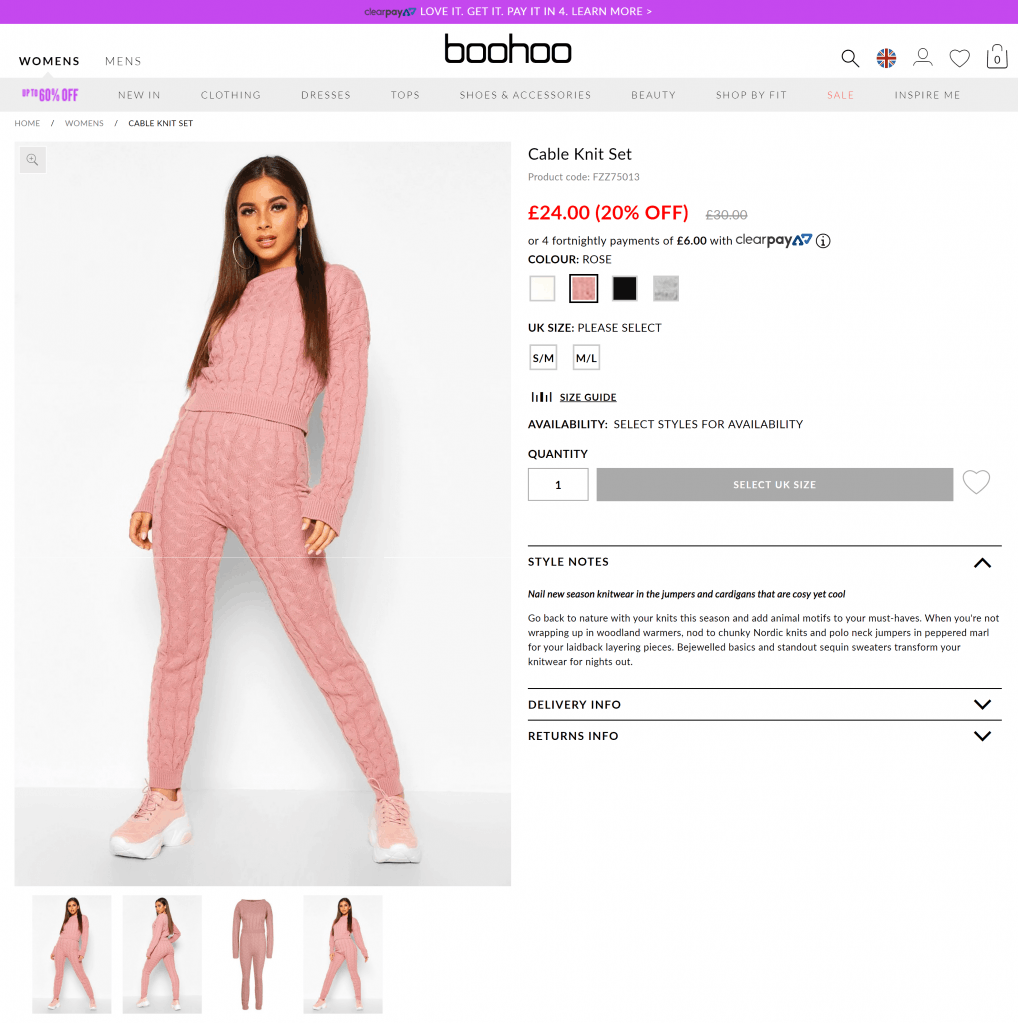
As a popular clothing retailer, boohoo.com features all of the specific elements needed in a product page to increase conversion rates.

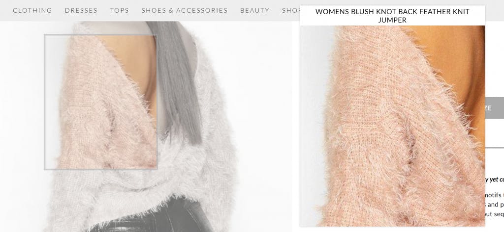
Boohoo.com also has a product zoom feature that allows you to inspect an item of clothing closer meaning that a customer can get a better idea of what the quality, material and pattern is like.

Clothing retailer oliverbonas.com has an incredibly interesting visual feature on their product lists where some of the pictures are replaced with videos of the models wearing the clothes. This draws the eye towards these specific products and also allows you to see the product from different angles without clicking into the singular product page.
An ecommerce homepage is an excellent opportunity for a brand to truly shine and create a lasting first impression. To quote Jakob Nielsen in his article about homepage usability, “Your homepage is often your first – and possibly your last – chance to attract and retain each customer, rather like the front page of a newspaper.”
When it comes to UX for homepages, there are a number of features that are considered best practice in order to ensure that the user’s journey is streamlined and efficient. On top of this, you also need to ensure that you stand out and appeal to your brands intended consumer base. For this, research on your consumer base is key!
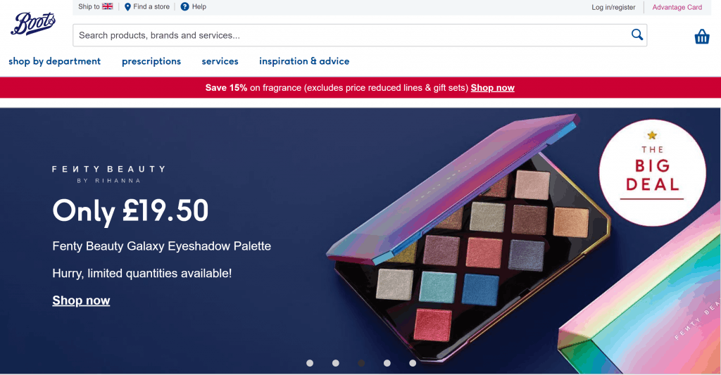
As a general overview of the best practices to follow, we’re going to look at boots.com’s homepage.

Boots UK Ltd. is a huge health and beauty retailer and pharmacy chain. As a brand that caters to a number of different consumers and also stocks a massive variety of products, it is key that their homepage follows the core features that apply to a wide demographic range.
For retailers that focus on specific products, the UX on the homepage needs to be personalised and targeted to specific audiences.
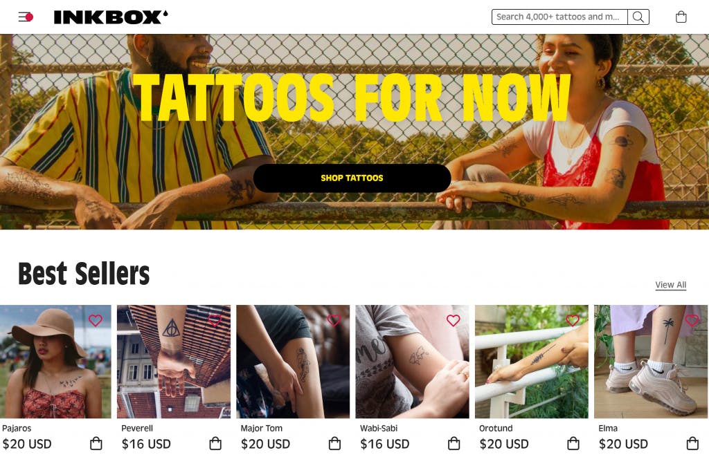
For example, let’s take a look at Inkbox.com.

Inkbox.com sells high-quality temporary tattoos and is an example of headless ecommerce which is when the front-end of the platform (in most cases, the template or the theme) is removed. This gives the frontend developer and UX Designer free reign to create UX from scratch that fits with the retailer and their brand, meaning a more individualistic shopping experience. The overall look on Inkbox.com’s homepage is incredibly distinctive and in line with their brand; with vibrant CTAs, best sellers, categories and trending tags displayed, benefit orientated value propostion (the BOGO sale), social proof (integration with TrustPilot) and information on how to apply the tattoos with the best results!
There you have it! Next time in our UX in Ecommerce series, we’ll be looking at menus, navigation, categories and search functionality.