Sign up to the Digital Six newsletter

Creating high quality content is essential for driving traffic to your site and maximising online sales and revenue. In order to achieve this, you should be regularly measuring the impact of your content. Google Analytics offers a vast amount of data so we’ve narrowed down some of the most useful sections for you. These not only help prove ROI, but they’ll also help your company make informed decisions for your content strategy.
It’s important that you create goals that are tailored to your business objectives. These could include account creations, trial sign-ups or checkout completions. Without setting up these goals, they can’t be measured so make sure these are in place.
One of the most useful elements of the Goals section is the funnel visualisation. This indicates which stage potential customers are entering and exiting a predefined user journey, specified in the Goal itself. Ecommerce companies can use a sales and/or checkout funnel, created by specifying the URLs of the journey a user could take while shopping. This can begin with the shopping cart page or landing pages of marketing campaigns, and end with the purchase confirmation page. Funnel drop-offs on a checkout Goal can highlight possible issues with checkout messaging – significant drop-offs at the shipping information stage could indicate unclear, or off-putting, delivery information that should be reviewed. Non-transactional funnels can also be created for goals such as email sign-ups. Once they’ve been set up, it gives great insight into the journey users take throughout your website. It also highlights opportunities to review and optimise your site’s content to maximise the conversion potential of each site session.
The User Explorer report was introduced earlier this year and lets you isolate and analyse an individual’s interactions rather than aggregate user behaviour. It displays a list of anonymous users with the number of their sessions ranked from highest to lowest (or you can switch it to ascending order.) You’ll also find each user’s average length of sessions, bounce rate, transactions, revenue and goal conversion rate. When one of the client/user IDs is selected, you’ll be able to view a range of information on their user experience. This includes every page they’ve visited and how long they stayed on each page.
Segments can be set up in this report so that you can explore each segment in depth. For example, looking at conversion paths of high spending customers can be useful as patterns can be identified to help you make improvements to the structure your content. Make sure you have a clear idea of which segments you want to target first before analysing the data on this detailed level. The level of data can be overwhelming so keeping things simple to begin with will help you digest the data and make clearer decisions regarding your content and how to optimise it for your target segments.
This report allows you to compare new visitors and returning visitors with various data such as the pages per session, average order value and ecommerce/goal conversion rates. It’s important to separate these two audiences as they have quite different user journeys.
Returning visitors will already be familiar with your brand and the website structure, however new visitors are likely to search for more information and are less likely to convert as easily as returning visitors. By gaining an understanding of these audiences (which you’re able to segment further) you will be able to target each group more effectively.
You can see below the reports that compare ecommerce conversion rates and the average order values with new vs returning customers.
It’s important that you know which pages visitors land on the most when visiting your website. Consider what makes each of these landing pages successful in gaining a high volume of traffic or high conversion rates. It could be down to the headings or formatting, as well as the content itself. Perhaps the content is more shareable than others or it may contain keywords that drive organic search traffic. By comparing these elements with other pages, you can gain insight into how other landing pages could be optimised.
You can also view the most common exit pages, which is also extremely useful. By investigating these pages, you can find possible reasons for why visitors are leaving the website from those pages. Perhaps there isn’t a clear call-to-action or the layout is confusing. This information can then be used for helping to define an A/B testing strategy.
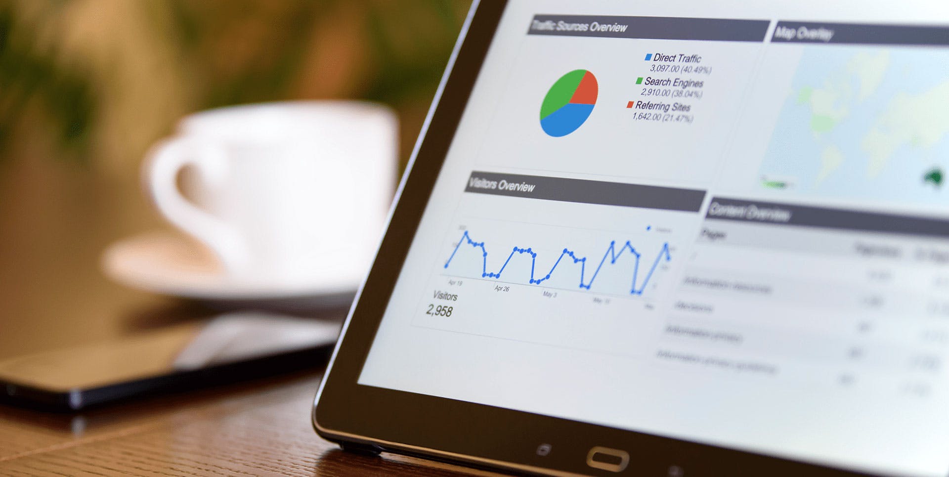
The ‘Channels’ section of ‘All Traffic’ shows you where your website’s traffic is originating from including referral, direct, organic search, social media, paid search and custom campaigns. This is ideal for getting an overview of how your marketing activities are performing.
Another section to look at is ‘Referrals’ which lists the domains that refer traffic to your site. You can click on to each domain to view the exact pages where users found the link. This is particularly useful to see how successfully your content is being distributed. If people find your content particularly interesting, they are more likely to reference it in their own content as well as share it among their audiences.
The Acquisition section in general is very useful for measuring content effectiveness; it can help you gain insight into the performance of your paid advertising, social, direct campaigns and SEO. For more information on these sections, take a look at Google Analytics.
By regularly checking and analysing these reports, you’ll be able to see which actions are making a positive impact and which areas need to be improved. Measuring your company’s goals is crucial in order to help your business growth, so make this a priority when using Google Analytics.
Gaining insight into user experience is also hugely beneficial as you can find new opportunities to build into your content and conversion strategies. This will help you better target your audience and help you create content that will resonate with them.