

Sign up to the Digital Six newsletter


Improving UX and accessibility is worth £17.1 billion to the ecommerce sector.
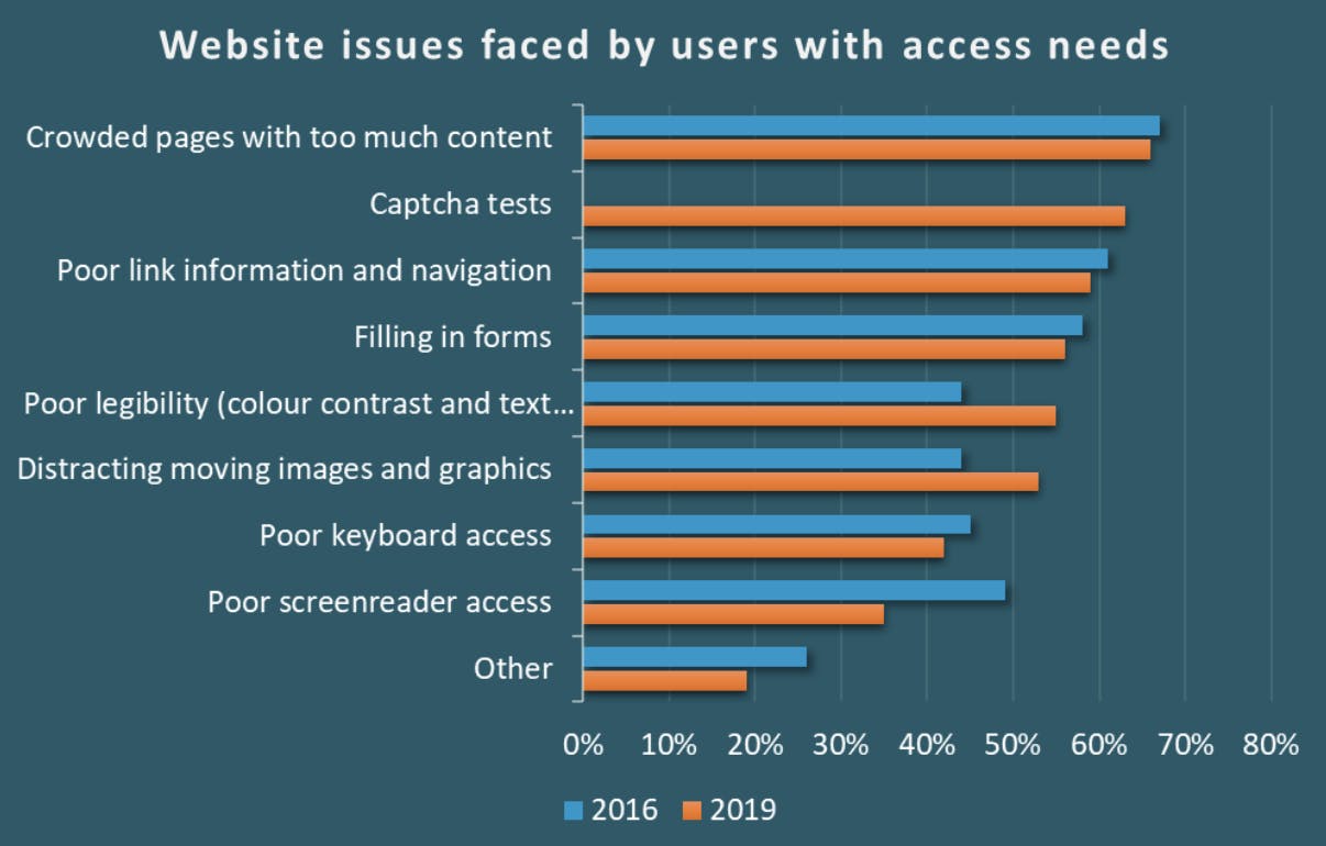
There are more than 7.15 million people online in the UK with access needs. And they want to shop online. But they can find it pretty difficult.
Issues like crowded pages, poor navigation, and distracting moving images stopped people using ecommerce websites like yours. Our guide to ecommerce web accessibility will help you identify these issues on your site.
We’ll outline what we mean by accessibility, then point out some of the most impactful ways to make your ecommerce website accessible. We’ve included steps on how to conduct an accessibility audit too.
WebAim’s study in February 2022 found that 96.8% of one million tested home pages did not pass WCAG accessibility standards.
User experience and accessibility improvements are often very simple to find and fix, but Click-Away Pound’s 2019 survey estimated they greatly contributed to ~£17.1 billion of lost revenue.
In fact, 75% of people with access needs said that “accessibility is more important […] than price”. And that’s not something you hear a lot in ecommerce.
PWC’s Customer Experience survey showed that “65% find a positive experience with a brand to be more influential than great advertising”.
So, it’s safe to say that fixing UX and accessibility issues will increase revenue and improve your brand. Likewise, improving your website for people with disabilities improves the website for everyone. Just like clearing a ramp first, rather than making it an after thought.

So, how do you ensure that your web content actually is accessible and stop haemorrhaging your slice of that £17.1 billion? Identify accessibility issues, then fix what’s not up to scratch.
Issues like crowded pages, poor navigation, and distracting moving images stop people using ecommerce websites like yours. The most common issue faced by users is crowded web pages with too much content.
Performing a full accessibility audit is the most thorough way to identify issues throughout your website.
However, it can be a substantial undertaking for ecommerce business and so, with the view that something is better than nothing, here’s a quick guide to ecommerce website accessibility. It includes some key tips, how to test for issues, and what ecommerce pages are most likely to be negatively affected.
Or, scroll down if you’d prefer to run a full accessibility audit.
Headings should use the correct HTML heading tags from <h1> to <h6> . Screen readers rely on your heading structure to navigate your page content. HTML section heading elements should keep your page content well-organised and easily navigable.
Quick test: Close your eyes and use a screen reader to navigate a random product page (ideally you won’t know what product). Can you easily figure out what the product is? Can you locate key product information like price, product description, and specifications?
Key ecommerce pages: product display pages, category pages, checkout pages, homepage.
Alternative text (or alt text) describes the appearance or function of an image on a web page. Alt text is used by screen readers to provide information to a user that can’t otherwise see the on-page images.
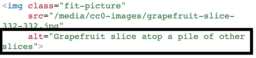
Learn more about writing great alt text in Moz’s SEO fundamentals documentation.
Quick test: Use a screen reader and close your eyes to navigate an image-heavy page. Can you access all the information contained in the images?
Key ecommerce pages: most/all.
Hyperlinks are the way predominant all users navigate the web. In ecommerce, hyperlinks help users complete actions like clicking your CTAs (call-to-action). But what if you don’t know where that CTA will go, or can’t even see the CTA?
A screen reader can be used to skip between links found on a page. This means that link text is often not read within the context of the page or surrounding content. A link with anchor text that says “click here” is highly ambiguous whereas a link that says “Read Our Delivery Information” likely leads to a page that contains delivery information.

Quick test: Visually inspect text links and check for the issues we’ve outlined. Update any links that use poor anchor text.
Key ecommerce pages: all.
Colour and colour contrast can be both helpful, and not when accessibility is in question. High contrast colours can help users pick out key areas of your content (when used correctly) but lower contrast colours might prevent users from being able to see your content clearly.
Try to avoid using red and green next to each other. 9% of men and 1% of women suffer from red/green colour deficiency.
Quick test: squint at your screen. Can you make out the different colours in form fields? Can you read coloured text? This quick test can help you instantly check your product pages and other key page templates for colour contrast issues. You can also use TPGI’s free Color Contrast Analyzer (CCA) tool which provides WCAG 2.1 recommendations.
Key ecommerce pages: product display pages, category pages, checkout pages, homepage.
Forms are critical to ecommerce websites. Without forms, you wouldn’t have a checkout.
Imagine your checkout page form fields are completely blank, how would you know where to input your name, address, and card number?
This is exactly the issue that users with accessibility needs encounter. No wonder there’s an estimated £17.1 billion in missed revenue (in the UK).
Forms should be labelled properly so that a screen reader can read cues about the content that each form field needs. Without form labels, it might be impossible to tell what content should be input.
WebAIM’s article on creating accessible forms goes into more detail and has working examples of correct and incorrect form field use.
Quick test: Use a screen reader with your screen switched off to see if your forms are navigable and usable.
Key ecommerce pages: checkout pages, contact page, any page with forms.
Mobility restrictions stop some users being able to use a mouse or a trackpad to control a cursor. This means they can only access your web content with keyboard or button inputs.
The Accessibility Developer Guide walks through the steps of browsing websites using only a keyboard.
All modern browsers offer keyboard input functionality but your website content will need to adhere to some basic design principles to make keyboard navigation accessible.
The easiest approach is to use standard HTML controls. They offer built-in support for keyboard interaction.
If custom elements (like interactive JS widgets) are essential, then make sure to adhere to a few best practices:
A common issue: Keyboard-only users can’t access dropdown menus that open on hover only.
Quick test: Use the tab, space, and enter keys to navigate a common user journey. Try moving from your homepage, to a category page, then to a product page, then through checkout options.
Key ecommerce pages: all.
ARIA (Accessible Rich Internet Applications) helps developers add accessibility information where standard HTML does not provide functionality.
ARIA roles can add vital information for users with screen readers (that HTML isn’t capable of) but if not implemented correctly it often creates a worse experience, so be careful when using ARIA.
The Accessibility Developer Guide includes a helpful chapter on ARIA best and worst practices.
Key ecommerce pages: all.
Dynamic content (moving content) can be very difficult for users with accessibility needs to interact with. Dynamic content includes things like:
These content types introduce several hurdles for accessibility. It’s important to evaluate your use of dynamic content and, if it’s crucial for a page’s purpose, ensure that it can be accessed. Some common dynamic content accessibility issues to consider are:
Key ecommerce pages: any page with dynamic content.
Performing a comprehensive web accessibility audit on your ecommerce can take significant resource but it’s always worthwhile investing in future-proofing your virtual storefront.
A manual review of your web pages is the best way to understand where your content does not meet the four principles of accessibility. However, for most large ecommerce sites with hundreds (or thousands, or millions) of pages a manual review of every website page would be unfathomable.
The NHS accessibility audit checklist defines a logic-based framework for auditing web-based content or services and it can reasonably be applied to ecommerce websites.
The scope defines the website, or section of a website, you’re auditing. Ecommerce websites often include these key areas:
Prioritise your audit by adopting a conversion-focussed approach to ecommerce accessibility. This means focussing on checkout and form areas first. Removing friction from the stages directly around checkout can have the greatest impact on overall conversion rates, and leave a good impression on users.
Remember: All your customers will benefit from a clear and explicit checkout process; but for some customers with disabilities, it is crucial.
Setting a clear scope at the start of your ecommerce accessibility audit will help it produce concise and valuable actions to take on a specific area of your website. Next, we’ll explore the scoped area and identify key areas.
Dig into the website like a user would. Identify how the website works and what user journeys are being completed in the area you’re exploring.
You’ll need to gather information on:
Next, select a specific sample to test. Here a sample might mean exploring one or two user journeys, or it could mean testing a set number of pages (rather than all of them). Here are some examples of a good sample size for an ecommerce website.
Remember you’ll be assuming that all pages within your sample will use uniform page templates.
Now audit your sample against WCAGs accessibility guidelines.
You’re essentially testing whether each page is perceivable, operable, understandable, and robust.
Record your findings in a table that states whether the page passes (and at what compliance level), fails, or has associated warnings.
A good accessibility report outlines the scope and sample of tested pages and provides a synopsis of:
In order to successfully test each page you’ll require a variety of hardware and software. Again, the NHS accessibility audit checklist outlines what is likely to be required.
You will need:
You will need:
Chrome browser needs to be configured with:
Addressing accessibility is best and easiest to do during the design stage of a website development project. It’s much harder to fix bugs after templates have been built.
If the statistics mentioned in the introduction don’t convince them enough… Get them to use your website with a screen reader and the screen switched off for an authentic user experience. It’s likely that your website will be fairly hard to navigate. Failing that, Silktide has a great video demonstration of how accessibility affects people in the real world.
Automated accessibility testing tools can only find a small percentage of the accessibility issues on a site. That said, they can be great to test very specific implementations.
Emojis in text may cause confusion for screen readers or cognitively impaired users. Don’t use them to convey important information.
Very. Screen readers can “skim read” pages by listening to the headers alone, so make sure headers are clear.
It’s hard to say exactly, but WebAIM’s February 2022 study found that only 3.2% of home pages (out of 1 million tested) passed WCAG’s accessibility criteria.
Web accessibility makes your website content usable and accessible for everyone, regardless of their abilities or disabilities. It’s not only a moral and legal obligation, but also a smart business strategy.
Do you think your website might be losing sales because of accessibility issues? Run through our quick guide to identifying and fixing common accessibility issues or get in touch with us today.
https://webaccess.berkeley.edu/resources/tips/web-accessibility