 News and Insights
Developing with Responsive Design
Why do we need it?
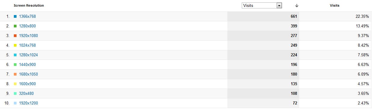
Over the last decade, we have seen a much greater need for websites to be more friendly towards varying screen sizes. Mobile phone ecommerce has become vibrant and with modern phones having screens as small as 240 pixels in width, there is a need for simple and effective websites that guide the user to your goal posts. On the other hand, users are also plugging their computers into their 1920 x 1020 pixel televisions, making perfectly good websites look small and isolated in a sea of background colour. The problem is that modern users now have such a diverse range of devices available to them that we need a better way to deliver web content to them. This demand can be seen through website statistics such as Google Analytics (see example below).
What is Responsive Design?
Responsive Design is a web design approach that allows websites to display at their best no matter what screen size or device visitors are using to browse. It allows you to choose what is shown and how it is shown for each screen size without the need for separate versions of your website i.e. a dedicated mobile version. There are 3 motives behind the Responsive Design mentality; to allow responsive layouts through Media Queries, to create layouts with relative sizing, and to make content/media dynamically resizeable.
How does it work?
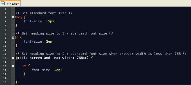
The first step of designing a responsive site is to make a fluid layout that will respond to browser resizing rather than be fixed width. Next, you would consider how your content/media will resize. Giving images a width of 100% means they will adjust to fill their container and if font sizes are all set using the “em” unit rather than “px”, you need only change the body font size so all fonts within child tags will mirror that change. It does get more difficult with video and images with absolute positioning but hopefully the principle is demonstrated. The last step is to add your Media Queries to alter your website to suit different screen sizes.
Media Queries were added as part of the on-going introduction of CSS3 to browsers and they are now work with most browsers, making it feasible to cater for tiny and large screens all within a single CSS file. You need to add Media Query’s for each resolution step that you wish a site alteration to occur. For example, let’s say you find that when looking at a screen with a width 768 pixels, you see that your main heading is too big and wraps on to the next line, which in turn pushes everything out of place and makes your site look messy. You can fix it easily by adding a Media Query to say, “I want to make that font (or all fonts) smaller when the screen size is 768 pixels or less.” Anything that can be applied through normal CSS can be applied inside a Media Query, making it completely customisable at the sizes you choose.
It sounds complex, right? It’s not. Look at this example that does exactly what I’ve mentioned within a few easy to follow lines. All you have to do is surround the resolution specific CSS with a condition.
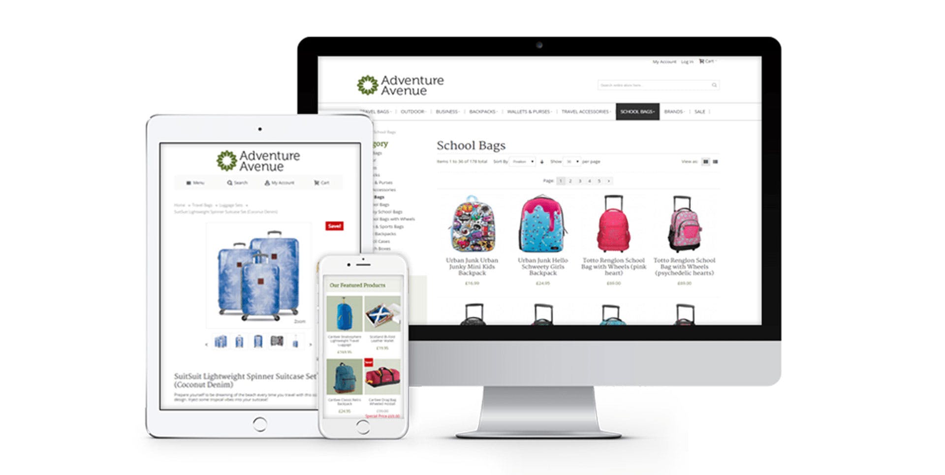
To put into perspective how powerful this control is, below is an iPhone screenshot and widescreen monitor screenshot of the Digital Six® website. The layout and sizing differ completely to suit the screen width, yet they use the exact same CSS file.
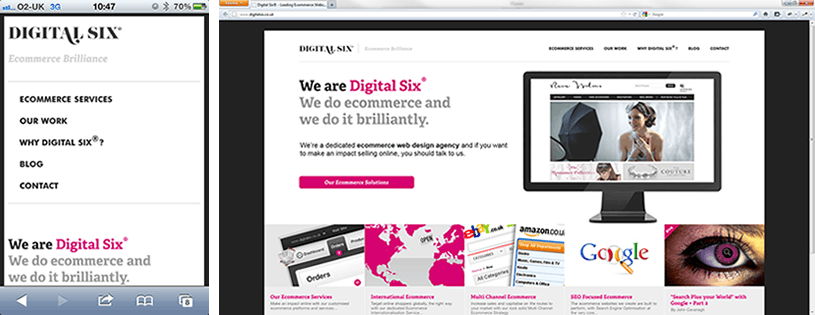
The iPhone layout looks simpler and easier to follow than the wider version. Space is a premium so certain content has been hidden to give priority to more important content. The intention is that the removal of clutter and the added convenience of being able to clearly navigate the site, makes users more likely to stay and read what we have to say.
The wide screen monitor version has more freedom and spare room can be used to isolate content into distinguishable regions. This is something the iPhone can’t offer and this was the main contributor in our layout decision making.
What are the pitfalls?
CSS3 Compatibility
Websites are rarely flawless across all browsers. Unfortunately, CSS3 has been interpreted differently by the various browser creators and the eternal argument over who is correct goes on. CSS3 is not officially released in all it’s glory as not all browsers support all features yet. The main culprit here is Internet Explorer 8 or earlier, which doesn’t support Media Queries. Windows XP is still used by many and it will only support up to Internet Explorer 8. Also, if we look at user statistics, we can see there are still a considerable amount of Internet Explorer 7 users that shouldn’t be ignored.
We recommend adding a condition that adds css3-mediaqueries.js to your site when IE 6 to 8 is detected. This will artificially add Media Query support to these browsers via some clever Javascript.
Web Fonts
If you use a font renderer such as Google Web Fonts or Cufon, then you may hit a problem. If you use Media Queries that rely on the user changing the browser size, changing the font size for a web font isn’t enough to alter it to suit the new browser size. You will need to use Javascript/jQuery to listen for a change in browser size and then run the refresh function (or equivalent) for that Web Font.
HTML5
If you are creating your site in HTML5 (a big can of worms), you will find that some browsers don’t recognise the new elements (such as “article”, “section” etc.). As a result, Media Queries often wont respond as expected because they are not considered to be block elements. We suggest getting to grips with Modernizr, which is capable of making older browsers act as if they support HTML5. It can save you from a lot of headaches.
Mobile Compatibility
Some mobiles enforce their own rules on websites in an attempt to make them fit their small screen in a manner it deems is easier to read. Luckily this can be overridden so you control the outcome of the site loading on any mobile. Adding to the “head” of your website will make the whole site fill the device screen size.
Video/Embedded Media
Sometimes you will find embedded media such as video players have their widths set in stone by their code. In most cases, you can figure out a way around it but it can involve some sneaky Javascript or unorthodox code tweaking (i.e. a hack). Unfortunately, there is no single way to solve all such dilemmas and each is solved on a case by case basis.
Testing
Not only are you faced with testing your site across multiple browsers, but you are now also faced with multiple device sizes. This makes testing more time consuming. Luckily, someone has already realised the need to make testing sites with Responsive Design a lot easier. Matt Kersley’s Responsive Design Testing is a website that will display your own site at lots of different widths at the same time, allowing you to check how it would look on mobile screens. It will save a lot of time!
Overall
Responsive Design is now an important part of displaying content on the web. It’s need is proven statistically and the benefits in improving marketing towards differing devices is obvious. The technology isn’t quite in place to allow us to create sites that include it naturally but it can be achieved if we give the lacking browsers a small push using workarounds.
Responsive Design increases website production time but it leaves you with a modern site, designed for a multitude of today’s platforms and therefore capable of delivering your information with clarity. This is paramount in an ecommerce environment as it could be the making of greater sales and a wider audience. If you do see an increase in sales over a long period, that additional production time is worth it, right?
This is the way the web is moving and it’s for the better.


