5 Ways To Help Improve Your Checkout Conversions
#1 Start with the cart
The shopping basket is a mighty crucial page. It’s almost always the last page a user sees before choosing to proceed to purchase. It has to be informative, assuring, and persuasive. At the very least, a good shopping basket page should do these 2 things:
- Reassure the customer that they’ve added the the correct items to their basket through clear descriptions, selected options, and images
- Calculate the entire cost the customer will be paying, including tax, delivery and discount
By providing a total cost to be paid on the basket page, your conversions should increase because the checkout process is not being diluted by those who are simply seeking the delivery cost or order total. Customers who know the bottom line and still proceed to checkout are therefore far more likely to complete their purchase.
#2 Suggest account registration after the purchase is complete, not before
So, the customer knows the grand total and is happy to take the next step of clicking the “Proceed To Checkout” button. You now know they’re probably quite serious about buying from you. So don’t risk scaring them off to your shop with your competitor by placing the obstacle of “Register For An Account” before they’ve even given you their name. Unless your product offering is of a very specific kind, most customers are simply trying to checkout as quickly and painlessly as possible, and can’t understand why you need their life story up front in order to buy from you.
You want the sale. It’s the most important thing. Let your customer complete their purchase without interference, and when they reach the “Thank You” page, that’s when to go for the the account registration. Providing a simple 1-step optional field to enter a password and save all details and purchase information will be viewed as a quick, convenient and free bonus which allows a user to record and track their order. Account Registration becomes a welcomed perk when placed at the end of the checkout, rather than an interruptive obstacle and possible hindrance at the start of it .
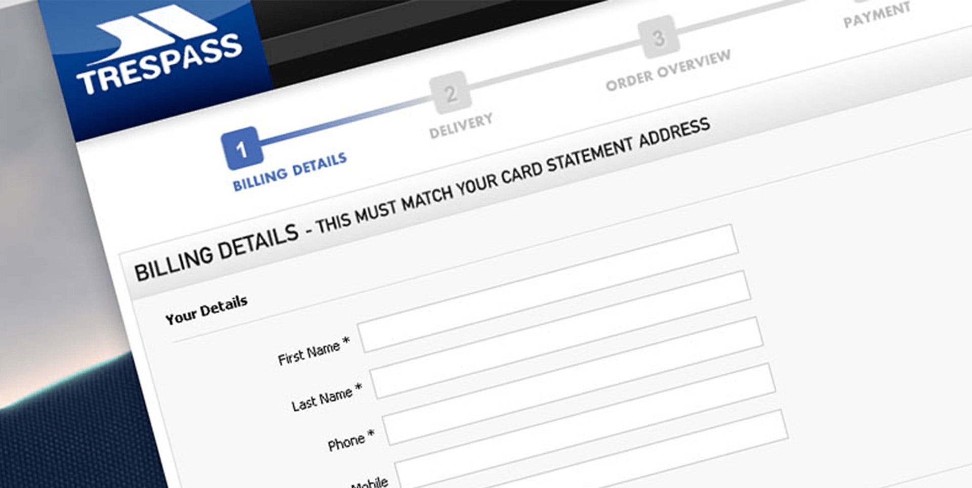
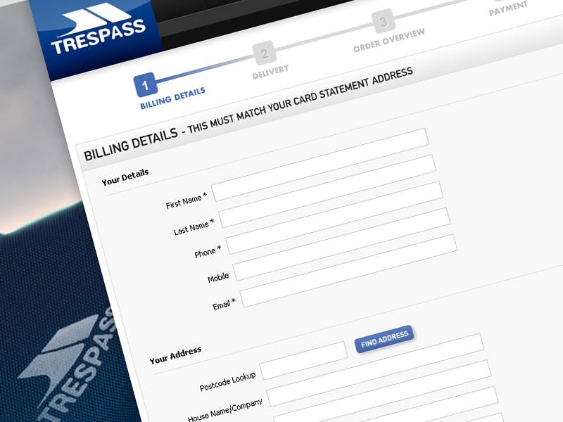
#3 Add a progress bar for clarity
A simple one yes, but many ecommerce websites lack this vital visual aid. Progress bars let users know what information you’re going to ask of them, and provides a comforting road map to the light at the end of the tunnel. It tells users where they are now, where they have come from, and reassures them that they are heading in the right direction. It also crucially indicates that their card will not be charged until they have reviewed their details (assuming you have a multi-page checkout process). You want your customers to be calm, collected and fearless, so shine a light on their journey and let them know that there is nothing to be scared of, and if they want to go back and edit something, they can.
#4 Remove distractions and keep the focus
An enclosed checkout replaced the standard header and footer used throughout a website with stripped down, navigation-free versions in an attempt to reduce temptation to keep on browsing. When users decide to stop shopping and start paying, let them do it without trying to pile other items into their hands or enticing them back onto the shop floor. No-one likes the hard sell, and on the web it’s as easy as closing a tab to abandon. Eliminate escape routes, eradicate distractions and remove links and buttons that direct the user anywhere but forward.
Also, anticipate what question might be going through the users head before they approach the order confirmation; “how much is delivery again?”, “does that come with batteries?” and provide “quick view” access links to delivery details, costs, and product detail without ever actually leaving the checkout.
#5 Label your forms so users know why you need all those details
It’s natural for web users to be wary of revealing their personal telephone number and home address online, so make sure you reassure your customers during the checkout by explaining why you ask for this information.
For email addresses, add a line or tooltip to explain you need this for emailing the order confirmation. Telephone numbers are often harder to justify, but if you require it for any reason, then let the user know that.
Delivery address needs little explanation and most users are happy to part with that, but the home address can be harder to accept when users don’t realise it’s needed to authorise the payment card or for security purposes. Again, a simple tooltip to explain why certain details are mandatory can go a long way to helping the user feel more comfortable about handing over those details. It also adds a sense of transparency and security that users know what’s really going to happen with their personal information.